
Resize Image Online Free
Change image width and height by pixels, percentage, or a ready-made preset. Keep the original proportions, preview the result, and download it as JPG, PNG, or WebP. All processing happens locally in your browser.
Choose an Image
Choose an Image
Select or drop a JPG, PNG, or WebP file to resize.
Your image is processed in this browser session. Processing speed and available image size depend on your device and browser.
What is image resizing and what happens when you resize?
Resizing changes the width and height of an image in pixels. A photo taken on a modern phone may be more than 4,000 pixels wide, even when a website, email, form, or profile page only needs a much smaller version.
For example, reducing a 2400 × 1600 pixel photo to 1200 × 800 removes unnecessary pixels while keeping the same proportions. The resized image is easier to display and usually faster to upload or share.
A smaller image will often have a smaller file size, but this is not guaranteed. The final size also depends on the selected file format, export quality, transparency, colours, and the amount of detail in the image.
How to resize an image
You can resize a JPG, PNG, or WebP image in four simple steps:
1. Choose an image
Drag your image into the upload area or select “Choose Image” to pick a file from your device.
2. Set the new size
Enter a width and height, select a percentage, or choose a preset. Keep the aspect-ratio lock enabled when you want to preserve the image’s original shape.
3. Choose an output format
Keep the original format or save the result as JPG, PNG, or WebP. Choose PNG or WebP when the image has a transparent background that you want to retain.
4. Resize and download
Select “Resize Image,” review the result, and download the finished file to your device.
Example: resize a large photo for a website
Suppose you have a 1920 × 1282 pixel landscape photo (216.21 KB) that is larger than your website needs. Selecting 50% scaling changes it to 960 × 641 pixels (61.94 KB) while preserving the original aspect ratio.
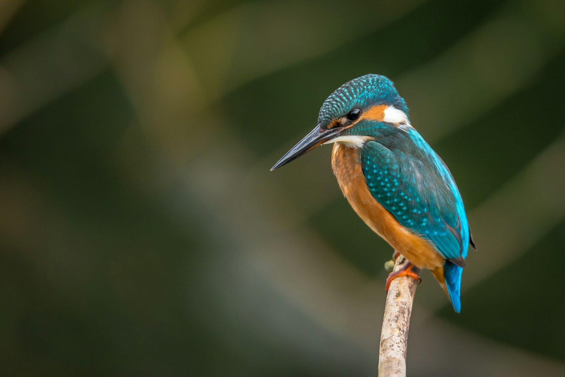
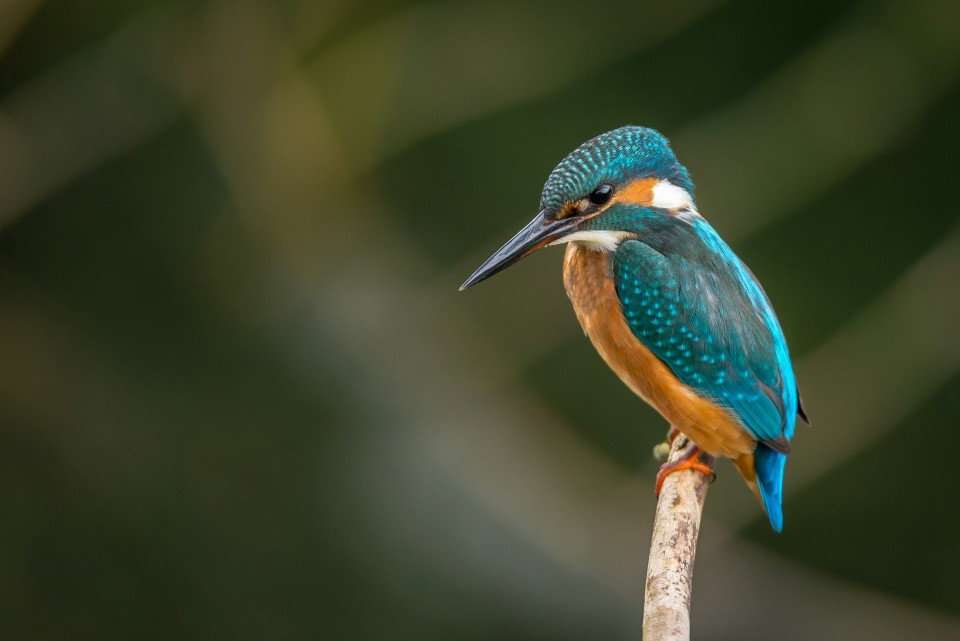
Website image example
The image is reduced to half its original width and height. Because both dimensions change by the same percentage, people, objects, and other details keep their natural proportions.
The result is a more practical size for an article, image gallery, product page, or blog post. Actual file size will vary depending on the image content, format, and quality setting.
Resize by pixels, percentage, or preset
Different tasks call for different ways of setting the output size. You may need an exact width for a form, a smaller copy for email, or a common layout for a website.
Exact pixel dimensions
Enter a specific width or height when a website, form, or document gives you a pixel limit. With aspect ratio enabled, the matching dimension is calculated automatically.
Percentage scaling
Scale the image relative to its original dimensions. A 2000 × 1000 image resized to 50% becomes 1000 × 500 pixels.
Common presets
Choose a ready-made size for square images, portrait layouts, stories, link previews, or HD thumbnails.
Be careful when enlarging small images
Increasing the dimensions of a small image does not restore missing detail. The result may look softer because the existing pixels are being spread across a larger area.
Why aspect ratio matters
Aspect ratio describes the relationship between an image’s width and height. Common examples include 1:1 for square images, 4:3 for many photographs, and 16:9 for widescreen layouts.
Keeping the aspect-ratio lock enabled prevents the image from stretching. For example, when a 1600 × 1200 image is resized to 800 pixels wide, the height automatically changes to 600 pixels.
If you enter width and height values that do not match the original proportion, people and objects may look too wide, too narrow, or unusually tall. When you need a different shape, crop the image first and then resize it.
Choose JPG, PNG, or WebP
The best output format depends on what the image contains and where you plan to use it.
| Format | Best for | Transparency | Things to know |
|---|---|---|---|
| JPG | Photographs and general uploads | No | Usually produces practical file sizes, but transparent areas must be replaced with a solid background. |
| PNG | Logos, screenshots, graphics, and text | Yes | Keeps sharp edges and transparency, but may create a larger file than JPG or WebP. |
| WebP | Modern websites and online content | Yes | Supports efficient compression and transparency in modern browsers. |
If you export a transparent PNG or WebP image as JPG, the transparent area will be replaced with a solid background because JPG does not support transparency.
Image resizing and compression are different
Resizing changes the number of pixels in an image. Compression focuses on reducing the amount of data used to store those pixels.
For example, resizing a 4000 × 3000 photo to 1200 × 900 changes its dimensions. Compressing the same photo may keep it at 4000 × 3000 while adjusting how the image data is stored.
Use this image resizer when you need a particular width or height. Use the Image Compressor when your main goal is to reduce file size. For a specific limit, such as 100 KB, use Compress Image to KB.
Common use cases and reasons to resize an image
Images are resized for many everyday tasks, from preparing a website thumbnail to meeting an upload limit on an application form.
| Common size | Typical use | Helpful note |
|---|---|---|
| 1080 × 1080 | Square posts, product images, and profile graphics | Works best when the original image is already square or has been cropped. |
| 1080 × 1350 | Portrait images and mobile-first layouts | Provides more vertical space than a square image. |
| 1080 × 1920 | Stories and full-screen vertical content | Uses a 9:16 aspect ratio. |
| 1200 × 630 | Link preview and Open Graph images | Check how text and important subjects appear when the image is cropped by different platforms. |
| 1280 × 720 | Video thumbnails and 16:9 website images | Suitable for widescreen content and preview graphics. |
These dimensions are useful starting points, not permanent rules. Websites and platforms may change their recommendations, so check the latest requirement before submitting an important image.
Browser processing and practical limits
Your image is resized in your browser
The image file itself is processed inside your browser and is not sent to TryFormatter for resizing. This is especially useful when working with personal photographs, screenshots, or documents that you would prefer to keep on your device.
Because the work uses your device’s available memory and processing power, very large images may take longer or may not open on older phones and low-memory browsers. If an image cannot be processed, try closing other browser tabs or starting with a smaller file.
Frequently Asked Questions
Is my image uploaded to a server?
The image file itself is processed inside your browser and is not sent to TryFormatter for resizing. The finished image remains on your device unless you choose to upload it somewhere else.
Can I enter an exact width and height?
Yes. Choose the Dimensions option and enter the width and height in pixels. Keep the aspect-ratio lock enabled when you want the second dimension to be calculated automatically.
How do I resize an image without stretching it?
Keep the aspect-ratio lock enabled. This adjusts the width and height together so the resized image keeps the same proportions as the original.
Can I resize an image by percentage?
Yes. Choose Percentage mode and enter a value such as 25%, 50%, 75%, or 200%. A 2000 × 1000 image resized to 50% becomes 1000 × 500 pixels.
Why does an enlarged image look blurry?
Enlarging increases the dimensions but does not recreate detail that is missing from the original. The existing pixels are spread across a larger area, so the result may look softer.
Why did the transparent background turn white?
JPG does not support transparent backgrounds. When a transparent PNG or WebP image is saved as JPG, the transparent area must be replaced with a solid colour. Choose PNG or WebP to keep transparency.
Will resizing always reduce the file size?
No. Reducing the dimensions often makes an image smaller, but the final file size also depends on the output format, quality setting, transparency, colours, and image detail.
Can I resize several images together?
This tool is designed for one image at a time. Use the Bulk Image Resizer when you need to resize several files in one batch.
Which output format should I choose?
Choose JPG for photographs, PNG for screenshots, logos, text, or transparent graphics, and WebP for efficient modern web images.
Does the image resizer work on mobile devices?
Yes. You can use it in supported mobile, tablet, and desktop browsers. Very large images may take longer on devices with limited memory.
Related Tools
Expert Guides & Tutorials

How to Optimize Images for Web Performance: The Ultimate 2026 Guide
Slow websites lose users. Learn the professional secrets of image optimization—from WebP conversion to bulk compression—and boost your Core Web Vitals instantly.
Read Guide →
JPG vs PNG vs WebP: Which Image Format is Best in 2026?
Choosing the right image format can make a huge difference in quality, file size, and website speed. Discover why WebP is the winner for 2026.
Read Guide →